Tuesday, April 21, 2009

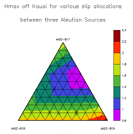
Triangular plot


A triangular plot displays information in the shape of a triangle. This shows the various slip locations in the Aleution sources.


Windrose


A windrose is a graphical tool utilized by meteorologists to depict how wind speed and direction are distributed at a specific location. Each color represents are certain range of wind speed. The direction of the wind depends on where the colors are pointing.


Climograph


A climograph is a graphical representation of the monthly precipitation and temperature conditions for a specific region. This climograph shows the amount of rainfall and temperature range throughout the year.


Population profile


Population profiles present a graphic overview of several demographic statistics collectedusing certain data. They can depict a wide range of variables through different methods. Here is an example of population with age range, sex, and immigration status.


Scatterplot


A scatterplot is a useful summary of a set of bivariate data (two variables), usually drawn before working out a linear correlation coefficient or fitting a regression line. It gives a good visual picture of the relationship between the two variables, and aids the interpretation of the correlation coefficient or regression model. This image shows the differences between a wiffe and husbands' age.


Index value plot


An index value plot is a type of visualization map. An index value that's not absolute is plotted on a line graph. This shows daily index cloisings in different countries.


Accumulative line graph or Lorenz curve


The lorenze curve graphically represents the cumulative distribution function of a probability distribution. It is frequently used to display income distribution. This shows the amount of income earned by the poorest 20% of the population.